6 AWESOME Design Concepts and MORE | PSID Evolution Exhibit
 |
| Nakikinig ng panghaharana na nagaganap sa labas ng kwarto ko. :D |
With the PSID Evolution Exhibit 2016, I found that you don't need a DeLorean Time machine (Back to the Future) to go and see The Past, Present and Future. PSID Evolution made it beautifully possible to interpret these timelines into our homes and create wonderful works of art at the same time.
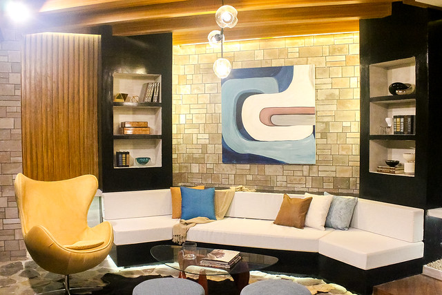
Said exhibit is made by the graduating students of the Philippine School of Interior Design Advanced Class of 2016. The Evolution Exhibit takes guests on a journey showcasing 24 exquisitely designed spaces that represent and are inspired from different time periods.
Being able to see each gallery gave me chills, as I was shown how creative and innovative these future interior designers are. With that, I show you guys my top favorites from said exhibit. These rooms have elements and designs that I would love to have in my own dreamhouse someday soon, but I know I would have to contact an interior designer to help make it unified and not 'chopsuy'. I have to tell you though that some of the works are a bit half-baked and not yet done, hence I'll be coming back for sure once it opens officially by the 30th. :D
Past:
Warren Platner Dining Room
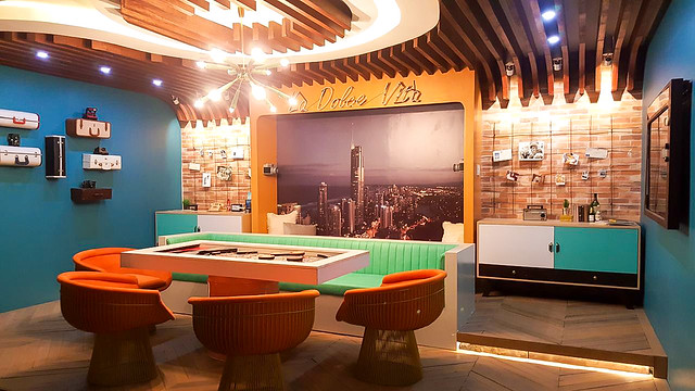
This 'midcentury cool' theme of the 60's room is perfect for for a very adventurous, creative and assertive person, or someone who would just want to enjoy the Retro Vibe when they invite friends over for dinner.
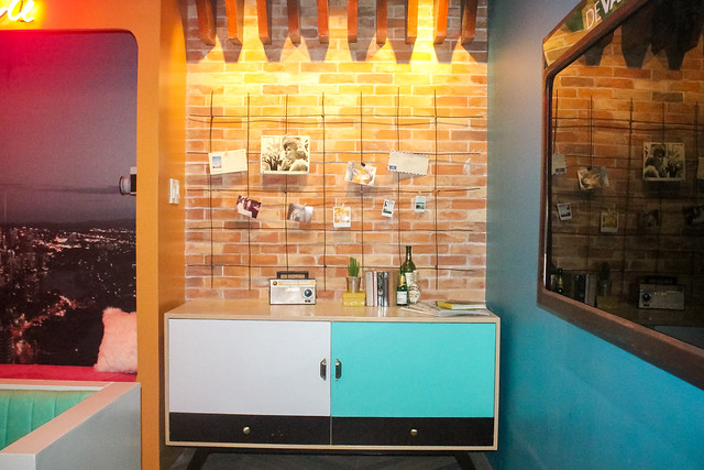
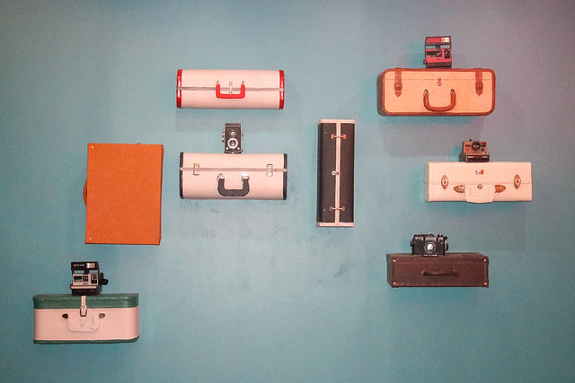
Colors of Mint, Salmon and Flame alongside wood and brick patterns and creative repurposed objects like the luggages for shelves or a working pinball machine-slash-table is what captured my attention. Plus I guess it's my old soul personality that's attracting me to this room. :D
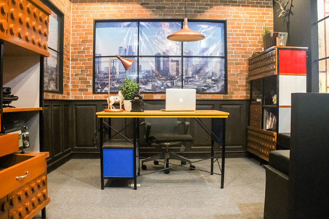
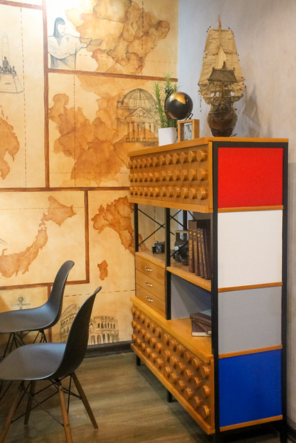
Charles Eams Study/ Library
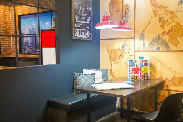
This one I love because mainly of the concept of lego shelves and the sense of travel embedded in said room. Play of lines and bold colors are balanced. I think I'd love to have it repurposed into the master's bedroom for my home though...
Present:
Modern Filipino Toilet and Bath
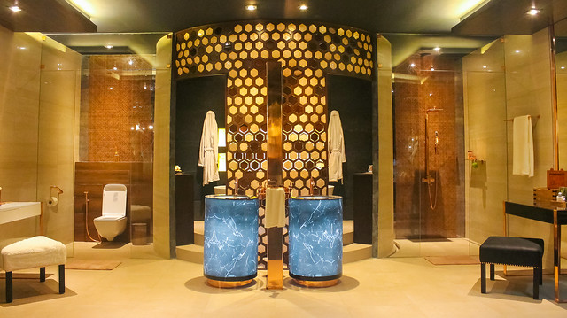
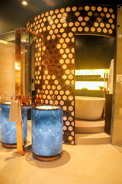
This room blew me away. I had never thought that pinoy design can be elevated to such heights. This is actually a his and hers bathroom, with symmetry and attention to detail in mind. Things to check out are how they modernized known filipino materials such as rattan and Capiz (usually used in vintage windows), and changed them into this beautiful piece of art-divider, curved honeycomb patterns that are made with rose-gold capiz panels. There's a surprise here in this room, which you'll have to go to check out for your own. All I can say is that it's quite ingenious. :D
[caption id="" align="aligncenter" width="640"]
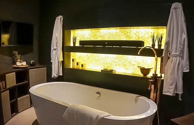 What's inside the capiz divider[/caption]
Modern Victorian Study/Library
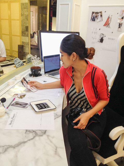
There is a certain charm that this Fashionista's library exudes.
[caption id="" align="aligncenter" width="640"]
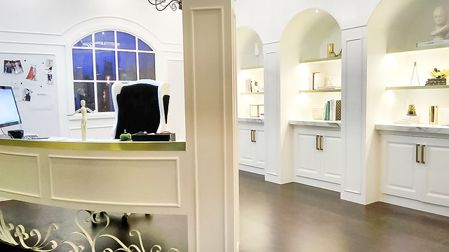 Photo by Chelle :D[/caption]
Clean spaces, organized, and a fusion of classic victorian and modern interior design is the brainchild of this room. I fell in love with the pattern, the chair and the little details like part of the walls being magnetized, hence you can write on them or place photos with magnets, much like a whiteboard.
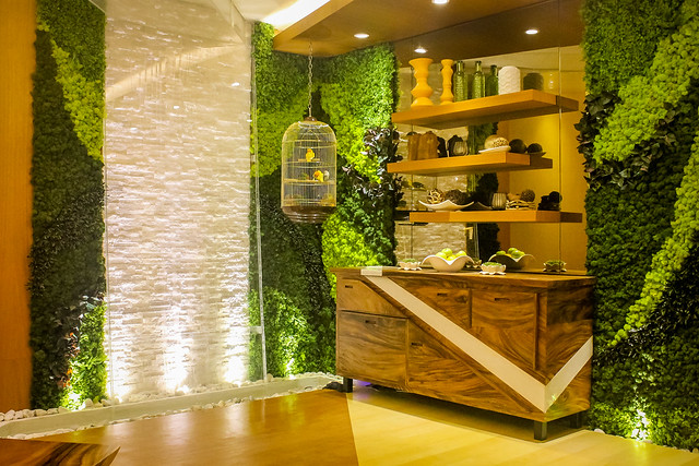
Modern Tropical Dining Room
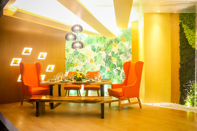
The point of fusing nature with a dining room is accomplished by interpreting the imperfection and rawness of nature. Hence their play on trying to give their client and experience of the senses, from touch, to sight, to sound (with the lovebirds) and smell the flowers.
Future
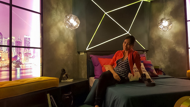
Funk Art Master Bedroom
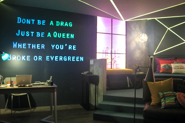
The mood of this room, the quote, the graffiti on the walls (there's another for the lady gaga fans. YOU HAVE TO CHECK THIS OUT) makes me think that if I were a single lady, then this would definitely be my own bedroom. I LOVE IT.
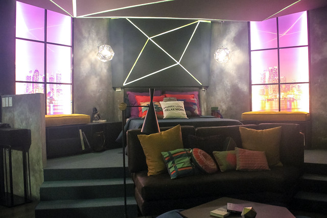
You see that smile? I'm at peace here. And maybe when I finally get that dream house, I can convince my husband to add elements of this room in our master's bedroom someday :D
 Nakikinig ng panghaharana na nagaganap sa labas ng kwarto ko. :D
PSID Evolution Exhibit 2016 will be open to the public, starting September 30 until October 31, 2016. Time is from 10AM-8PM on weekdays and 10AM-9PM on weekends at the G/F Square Building Greenfield District, Mandaluyong City. Free Admission! :D
The exhibition is supported by Devant, Uratex, Boysen, Hafele, Bosch, Blanco Germany, Gorenje, Dexterton, La Europa Ceramica, Songdream, Nordlux, Matimco, AG Murals, Mity Mike, Larry’s Curtain, Mainline Fineza, and Ilaw Atbp.

.jpg)

Hahaha totally love your reference to Back to the future! I love this. They all have their own beauty. My preference would be the past. I totally love the Warrwn Platner dining room. That would be so cool!!
ReplyDeleteNow way admission is free?! I cry! I love the ideas shown here. And the concept of showing the past, present, and future, something more to look forward indeed!
ReplyDeleteThere's a total of 24 booths, so you have a lot of things to check out :D
ReplyDeleteThanks for sharing this, Nix! Tamang-tama for my 7th grader’s lessons on interior design and architecture. :)
ReplyDeleteThanks! You should stop by sometime in the exhibit to experience it fully. Marami pa kasing designs na nadun... :D Just get a ride to MRT Shaw and walk a but going to Square Building sa Greenfield District. :D
ReplyDeleteI love the Tropical Dining Room! The colors of those orange chairs and the plants on the wall, very very cool. The fashionista library/study was very classy indeed. The 60's living room? Epic! Straight out of the later seasons of Bewitched. I'd love to go see this exhibit. Too bad I'm not in Manila!
ReplyDeleteWow! It's that time of the year again where students of PSID do an exhibition of interior design. I can't believe it's over a year that I blogged about their exhibit which was different styles of 24 sq.m. condo space. Anyway, I agree with you that interior designers are needed for a home or room to have a unified theme. Their fees may be expensive but I think it's worth it since they help also make the room more spacious and help save money on the furniture since they know where a furniture should be bought or be built-in.
ReplyDeleteFor this year's exhibits, what I liked was the Tropical Dining Room. How I wish they can use that concept for a restaurant. I think it would be lovely.
I like going around design or decor stores when I go to the mall. It was one of my favorite past times when I was still single. I still do this now but very seldom when I am with the kids. I even wanted to study at PSID before. :)
ReplyDelete