Ten Inspiring Interior Design Concepts for your Home | PSID Juxtapose : Espasyo at Panahon
Times are always a changing and you can see this with how our own culture is transforming. Of course, the easiest way to explain this is through a city's structures, how things look before and how these same structures are adapting to modern times.
Adaptive Reuse is the Philippine School of Interior Design's (PSID) heart in their latest exhibit for 2018, aplty named PSID Juxtapose : Espasyo at Panahon. This theme aims to show creative and relevant solutions when restoring and rehabilitating old historical sites. The graduates of PSID tried to make it with respect to the herritage behind the structures while making things interesting for the next generation. Imagine going inside an instagrammable dorm and realizing the history behind that building.
Graduates of PSID created 17 booths that are divided into three segments, named Tahanan, Pangkalakal and Pang Industriya*. While these are done with the purpose of finding design in mixing old and new, we can also see aspects that we can insert into our own homes when we want to spice it up a bit.
These are also named by what the booth was before they redesigned it, with tahanan being old herritage homes, pangkalakal being commercial streetscapes and pang industriya being design solutions for industrial sites like fire stations or old train stations.
I'll be including mostly the themes that I really liked and I'll explain how we can interpret this into our own needs either in the office or at home.
*Tahanan, pangkalakal and Pang industriya is Home, Trade and Industry.
Tahanan
The Bar Beneath…in San Juan by Andrew Nieves, Merryl Ngo-Dee, Rosemarie Tapay, Jessica Pedreno
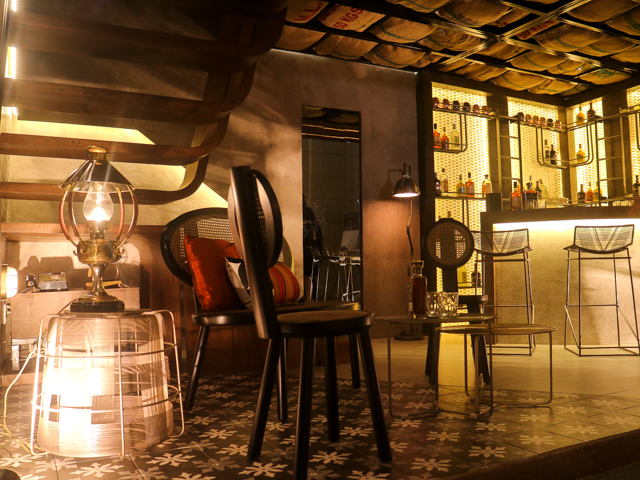
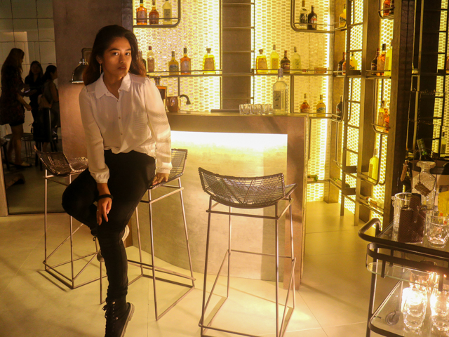
This speakeasy's history is one for the books. Built in 1933 by Sps. Melquiades and Victoria Castro, the house hides a 15 sqm bomb shelter underneath its kitchen floor, which was the inspiration for what Andrew, Merryl, Rosemarie and Jessica turned it into. They added a secret door to the mess hall (or cr) hidden within mirrors to replicate the feel of the said secrets of the bomb shelter.
While the mood or lights is pretty dark and yellow in color, aspects like the secret door (shown as a mirror), the details made within the bar and the staircase are some of the things that we can add in to our own homes as well.
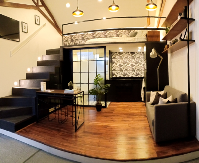
Small Space, Big Living by booth 3 members Cess Ang, Nina Magana, Mae Matias, Cariz Yam.
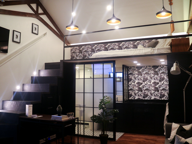
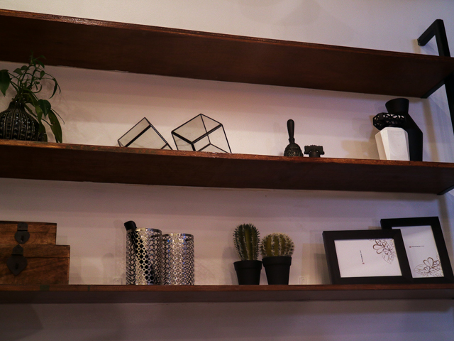
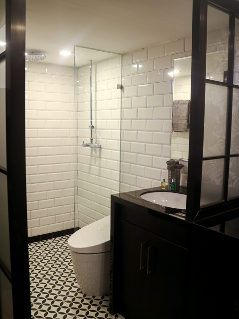
They managed to make it a balance of modern and still pay respect to the heritage house by the wooden floors, the spanish tiles and patterns albeit doing this in a black and white scheme for a minimalist feel. This is a great inspiration for those living in a studio room condominium or small house.
Two booths inside Tahanan that caught my attention for different reasons is the femininity of the Bridal Atelier (booth 2 Donna Causapin, Lara Ong, Ana Roble, Nikka Merro) and the oldness of the Bridal Boudoir(booth 5, Janz Go, Faye Cascante, Jaja Jagunap) .
Bridal Atelier (booth 2 Donna Causapin, Lara Ong, Ana Roble, Nikka Merro)
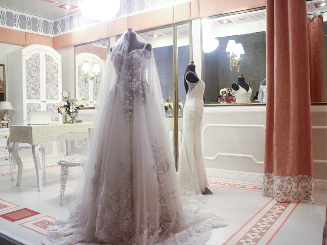
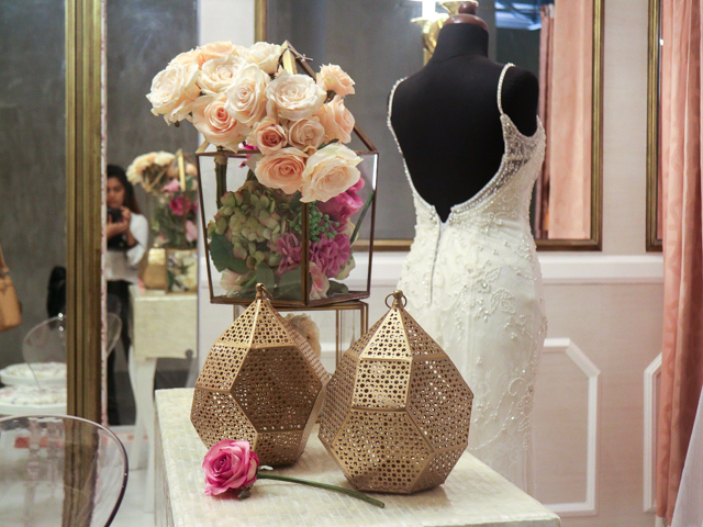
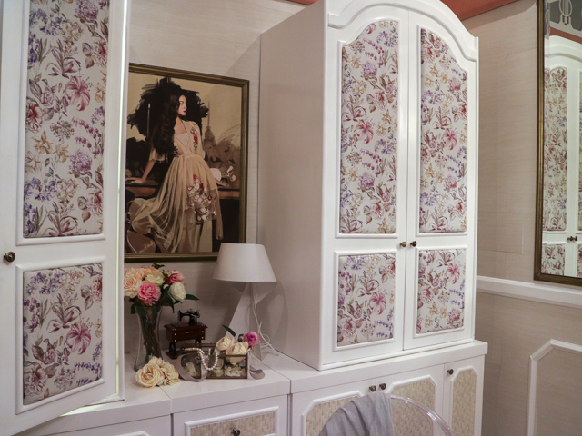
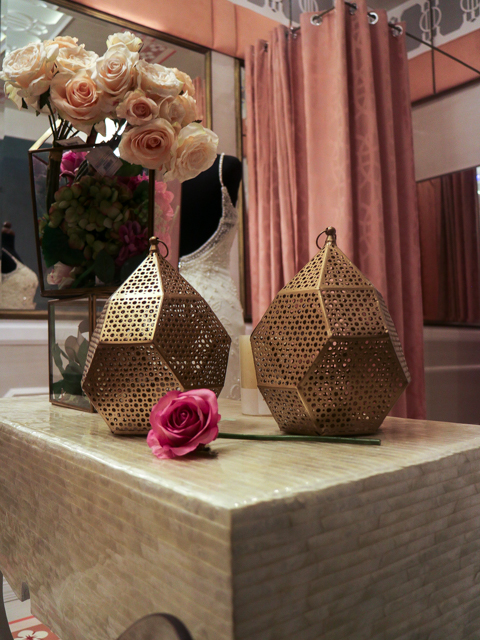
Bridal Atelier hit the spot when it came to repurposing the herritage house given to them. I love the details that went in the booth, the femininity shown through subtle things like tasteful flower decor within the closets, the beautiful painting and the way they tried to make fitting rooms for this bridal designer's shop not disruptive by adding in pipings to put curtains in . Mirrors are also installed with beauty lights to perfectly capture the bride or bridesmaid's beauty when trying out the designer's clothes for fitting.
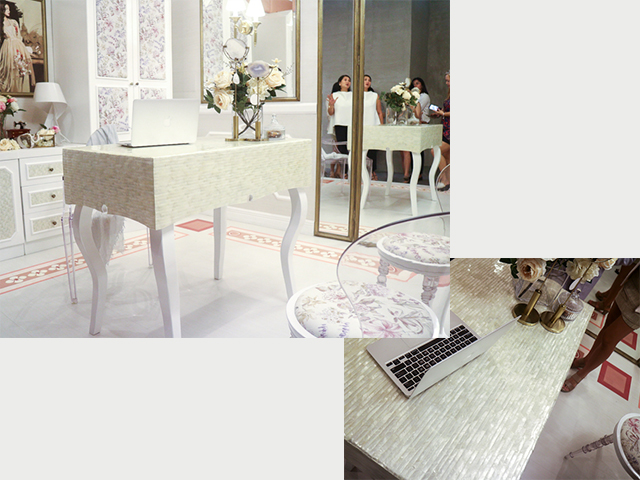
An interesting use of Capiz is shown here.
And it's total opposite is the Bridal Boudoir which I felt out of the mark with the theme of Adaptive Reuse.
Bridal Boudoir(booth 5, Janz Go, Faye Cascante, Jaja Jagunap) .
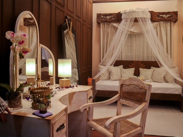
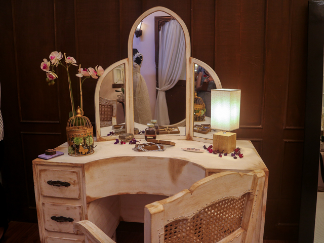
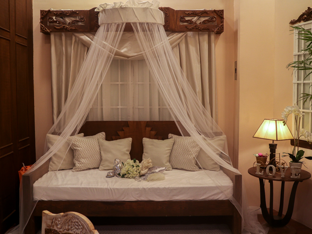
I understand that the Bridal Boudoir is trying to pay respects to the house that was assigned for them to design, but they could have done a better job of "modernizing" such a heritage site. To me, this felt like an exhibit that would be better placed in the "Past Present and Future" exhibit PSID did a couple of years ago because it only felt like me going inside an old house. The idea of adaptive reuse and showing this within the design of the heritage site is lost on me. There are aspects that they could have done better on like changing the ambiance of the place via the lights, or by adding in some modern aspects in choice of trinkets that might just make it within these aspects of "Adaptive Reuse".
Booth 4 and Booth 6 are similarly themed, and yet they managed to give a great design that perfectly balances old and new. These booths are great inspirations for those who plan on opening a spa, or who wants a little haven of nature within their own home.
Modern Filipino Haven by Kim Tigue, Kristine Escober, Pam Lachica, Mary Teng
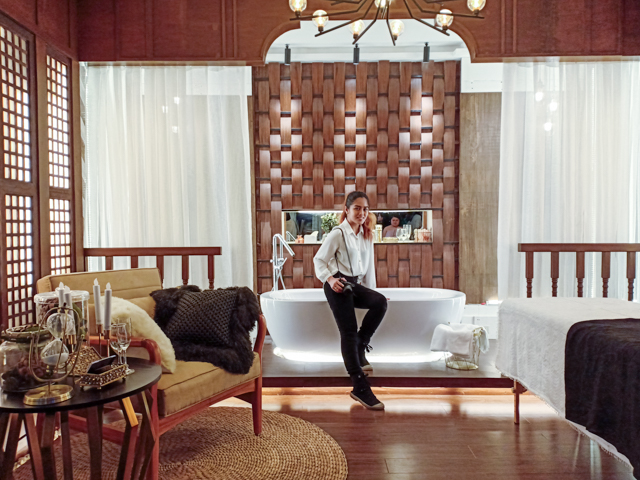
Booth 4's Modern Filipino Haven is created by Kim Tigue, Kristine Escober, Pam Lachica, Mary Teng, and the site given to them was the the Laurel Ancestral House, one of the first houses built in 1927, along F. Benitez St. in San Juan. The group has chosen to adaptively reuse Laurel’s Ancestral House as a Private Spa, with three aspects being the massage area, the tub area and lounge area. Quite spacious, and the use of wood in such a pattern as the one seen at the center, along with the textures of the pebbles made this modern and the ambient lighting helped to give respects to the old look of the site. The aim was to also invigorate the five senses and I feel they managed it right.
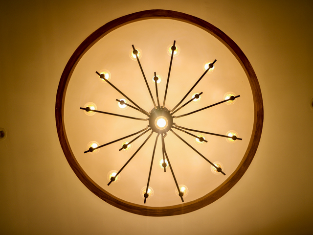
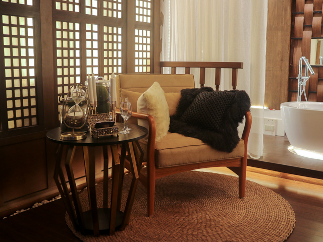
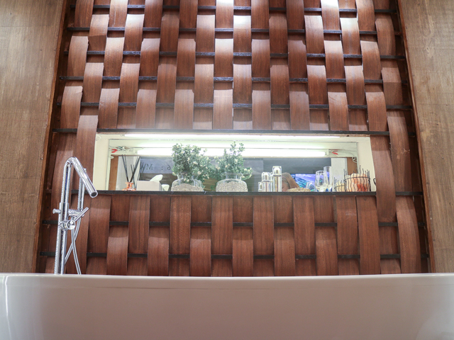
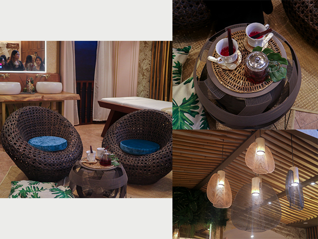
Marahuyo Spa and Tea House by Alissa Villareal, Sam Javier, Chloe Nabayo, Kiana Umali
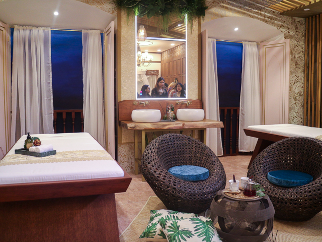
Booth 6's Marahuyo Spa and Tea House managed the same balance but with a different effect. The spa centered on the Filipino ancient art of healing or ‘hilot’ with the use of volcanic rock massage, while the teahouse will highlight special herbal teas grown right in the backyard of the house. With the design, they got pieces that are unique and natural in pattern but is also something quite durable.
Pangkalakal
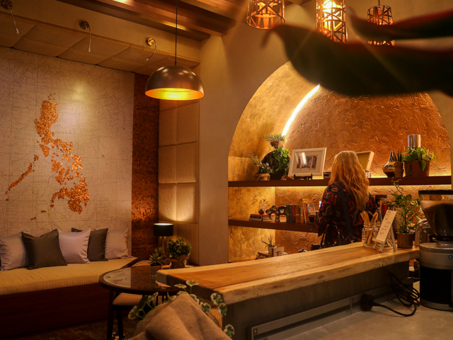
La Moneda Bookshop and Cafe by Alexis Casas, Tin Jaspio, Lauren Laudico, Hannah Tan
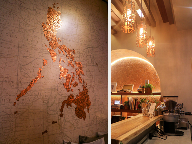
This is the Aduana Building in Intramuros revived as a bustling commercial building with a bookshop and café, attracting tourists and locals alike. I do wish to see an actual cafe like this in Intramuros. Or at least wish that they did serve coffee in this booth! hahaha! The centerpiece which is the lounge with a map of the Philippines made entirely of 5 centavo coins and 10 centavo coins is also really enthralling. Although I do wish they added some more white lights because as it is a book shop, the light is not conducive to reading for long hours. Other than that, this is a perfectly modernized design that still gives respect to what it was before.
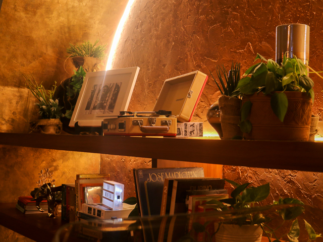
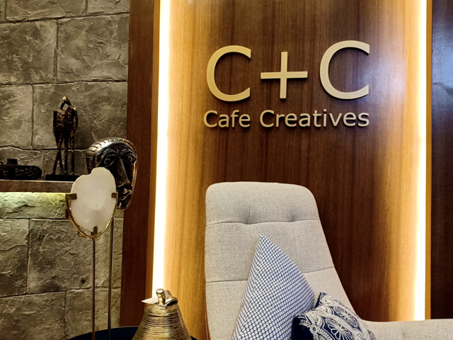
CC (Cafe+Creatives) by Liz Catadman, Joyce Gozos, Geline Ignacio, Elvira Pareja
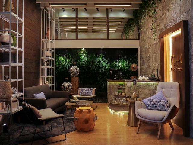
The basis for this is the old PSID Building located in Psong Tamo, Makati. Built during the 1960s, the building boasts of a contemporary modern design not common during that era.
Dubbed Cafe+Creatives (CC), the design revolves around the theme of contemporary modern Filipino Ingenuity in its organic form, prioritizing human needs within a space.
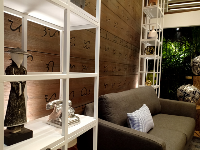
I personally am in love with the Baybayin or Alibata wall, and how organic and chill this place is. Certain elements like the organic plants and the wood binds the whole design together. This set up can also work as a living room in my opinion
Cafe 308 by Abi Lazo
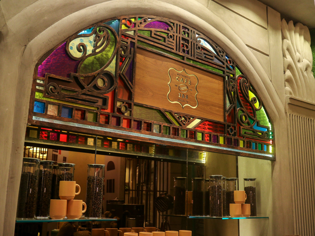
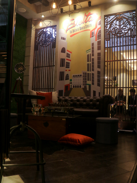
Assigned the Regina Building, located in Binondo, this is one of the few buildings in Escolta that has survived the horrors of World War II. Turning this iconic building into a cafe that does not only scream IG worthy but is also a place you would think is something located outside of the Philippines.
While the facade is retained, the interiors are finished in an industrial-retro style brought forth in the 21st century. Aged wood planks juxtaposed with concrete make up the floor, while a contemporary wall mural of Escolta and a vertical plant wall liven up the space.
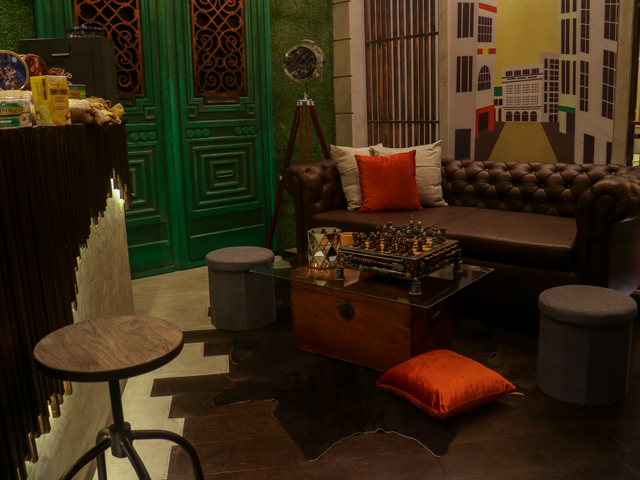
The furniture are also well thought of and picked to ensure consistency in the design, as well as the lighting that is not too yellow and not too white- to creating an environment that is of the past and the present.
Pang Industriya
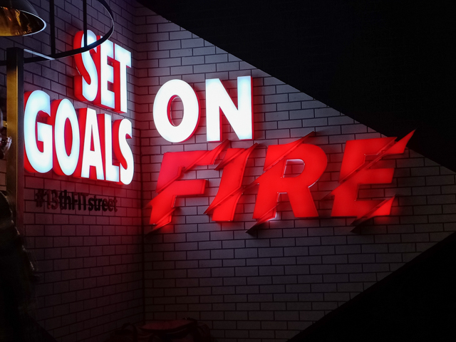
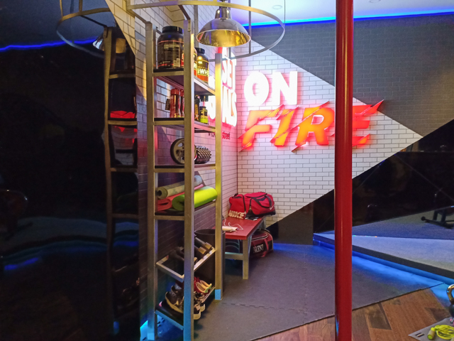
13 Fit Street by Jess Arellano, Cee Reganion, Bianca Francisco, Mariel Consolacion
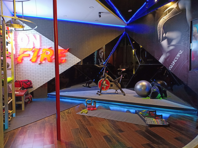
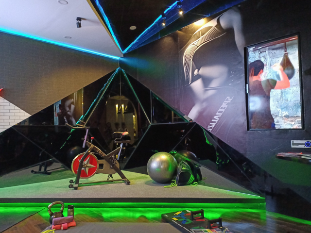
The first gym designed by PSID students, this the Tanduay Fire Station - the oldest operating fire station in Manila’s University Belt area. Since the place assigned to them is around the U Belt, it makes sense that they cater to this generation's healthy living lifestyle. They thought of everything from a place for yoga/dance class, a pole dancing area and the usual gym buff equipment. The lights can be controlled to move much like disco lights or a stationary one, and the way they used geometric shapes to give division to the place is also nice.
KM 102 Gentleman’s Barber Lounge by Justine Dacudao, Christina Locsin, Dianne Gonzales, Jane Oracion
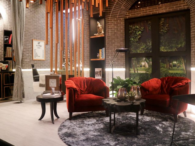
Built in 1892, the San Fernando Train Station is part of the Ferrocarril de Manila-Dagupan, the first railway system in the Philippines. Today, the San Fernando Train Station is reimagined into a Gentleman’s Barber Lounge.
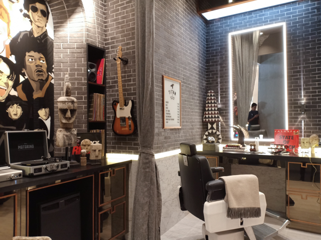
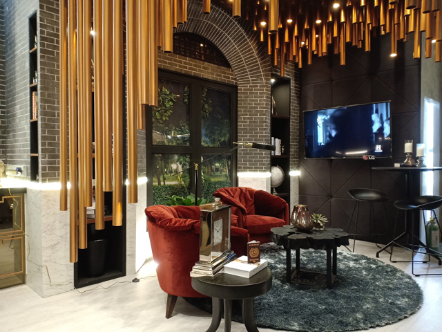
The details of this place screams sophisticated. Albeit the bronze ceiling is something that I would not put in my home, I do really love it and I think it is what gave this exhibit an edge. Kinda reminds me of the Bamboo Organ Church in Las Pinas, and the retro vibes of the mural also helped in making this all tied up.
The concept of mixing old and the new is translated not just by the experience offered in the Lounge but also in its design. The original brick walls are retained and juxtaposed with marble panels immersing the entire space with a sense of darkness, intrigue, and understated luxury.
So those are just some of the booths that you will get to experience when you come in this year's PSID Exhibit. I hope that this piqued your interest cause I left out some more really awesome designs and you have to go and see it for yourself!

.jpg)

I kinda miss attending events like this. Honestly, I have my faves among the ones that you shared. I always admire people who are in the design field because they go through revisions and hardships yet, the result always mesmerizes people. Now, I wish I could have one of those in my life and I'll be the happiest girl ever! Haha!
ReplyDeleteBtw, what camera are you using? Great captures!
I love this post!!! Will definitely try to give it a try designing our small house to look this fancy. So extra!
ReplyDeleteReading this article makes me want to learn interior design! Such a nice profession, could be
ReplyDeleteThe design concepts were nice! I think you really put such effort in creating this blog. Thank you for sharing this! I'm saving it for future reference
ReplyDeleteI love the concepts that you introduced here! Especially the design of the mini bar and the last photo. The one with the gold tubes and has that rustic feel. I'd love to visit this place some other time. ♥
ReplyDeleteThis is a great place to visit.. They are so talented! I actually love all of it! lol! Love the concepts, designs and all.. I wish to visit it before it ends
ReplyDeleteI like the small space, big living concept! I hope I get to attend to this kind of event too.
ReplyDeleteInteresting concepts and designs they showcased this year. I like that centerpiece of Philippine map made of 5-centavo coin. Who is the designer?
ReplyDeleteImpeccable designs. Just goes to show that PSID is a premier interior design institution.
ReplyDeleteAll those concepts look so classy! How I wish I can transform my office like one of those!
ReplyDeletePangarap ko talaga ang PSID. As in!!! Ganda ng designs nila ah
ReplyDeleteAng galing. Sana pag nanalo ako sa lotto I can make my house look like that
ReplyDeleteMy favorite is Gentleman's Barber Lounge.. I actually love all.. They're all amazing..
ReplyDelete